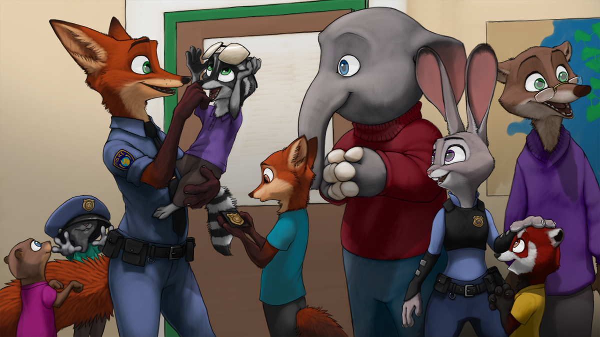
I'm willing to bet money that Nick is great with kids.
Regardless of whether or not he'd admit to it, if I'm any judge of character at all, Nick loves being a role model ... and by the looks of it, he already has a young votary. Considering the underlying current of negligent speciesisms in Zootopia, Judy and Nick are just about the perfect representatives for the ZPD and a potential change of heart for the future - but that's just my two cents.
I am still not quite satisfied with the look of the picture, but I figure any more work and I'm just gonna make it all worse and this is the limit of my abilities for this particular piece. What bothers me most is that the colors seem to be competing for attention and the background/foreground relations don't translate the way they do in my head. I could probably emphasise the distance with a bit of blur on Judy and her red panda fan, but it just feels like a cheap gimmick effect at this point and I feel it takes away from the picture. Any pointers are much appreciated.
On other notes; I can now draw both Judy and Nick almost entirely reference free, with a few hickups to fix here and there - yay~! X3 Mate pointed out to me that I was making the iris's too small, so with that fixed the characters feel a lot more like the actual thing now too.
Judy Hopps, Nicholas P. Wilde and Zootopia are © to Disney Entertainment Ltd.
Art is © to iPoke
Category Artwork (Digital) / Fanart
Species Mammal (Other)
Gender Multiple characters
Size 1200 x 675px
File Size 2.34 MB
Listed in Folders
She wasn't supposed to be tall at all, she was just supposed to be in the foreground, but the effect just wouldn't work out >.<
Did a resizing fix. She's still slightly infront of everyone, so she's not down on her level entirely, but it still looks better than what it was before 9.9 still not satisfied with the look, but I just can't seem to get it right
Did a resizing fix. She's still slightly infront of everyone, so she's not down on her level entirely, but it still looks better than what it was before 9.9 still not satisfied with the look, but I just can't seem to get it right
Since there is no "standard" against which they can be measured -- everything is either scaled down to Judy's size so she looks normal, or scaled up to the size of the big mammals so she looks super-tiny, there is a lot of confusion about Judy's height.
But she does maintain her height consistency with Nick as being a head shorter than he is. So yes, I'd say her height was done accurately in this pic.
But she does maintain her height consistency with Nick as being a head shorter than he is. So yes, I'd say her height was done accurately in this pic.
iPoke's icon is from the music video for Evil Eye by Franz Ferdinand. https://youtu.be/IIR5vBiC3ig?t=34
well we all make mistakes that make us want to do better next time, the same thing that bothers you bothers me too it seems, only thing i see is that Judy looks too big, i figured it was foreground but as you said, it doesn't translate properly. still you do a better job than me
This tugs at my heartstrings hardcore. It's that young fox that does it for me, staring at his badge in wonderance and awe and seeing that someone that looks like him ended up as a cop despite all the stereotypes of Foxes being shifty and untrustworthy.
*sniff*
THERE'S JUST SOMETHING IN MY EYE, THAT'S ALL.
*sniff*
THERE'S JUST SOMETHING IN MY EYE, THAT'S ALL.
I think the challenge that comes along with this is understandable. In a lot of movies and art, furry characters are all the same height and relative weight to make things easier. It must have been a real undertaking to get all the animals' dimensions and proportions right when they're standing next to one another, or how to come up with workarounds to make it feasible for them to interact (like the pneumo tube for the smoothies).
Great job. Try not to worry about the perspective.
Great job. Try not to worry about the perspective.
They look so freakin' cute! And if anything? Fighting against society's prejudice takes more than one grand gesture, but also many little battles to change hearts and minds, much like this one pictured.
I know this is likely prodding fate, but Nick does look like he'd be a great dad. =P
I know this is likely prodding fate, but Nick does look like he'd be a great dad. =P
Something many people tend to overlook. Changing a societies point of view isn't just done in a day, it needs to be a thing and then have backing behind it, otherwise the gesture just becomes a momentary gimmick.
And yeah, I'm sure Nick would be a great dad. Fingers crossed he's fine with adoption ^^;
And yeah, I'm sure Nick would be a great dad. Fingers crossed he's fine with adoption ^^;
I love the kid who's wearing Nick's hat. Youngsters love handling accessories like that (and the sunglasses, and the badge). I did a short talk for some cub scouts once while wearing my football official's uniform. The kids were fascinated with my flags, beanbags, whistle,... anything I could pass around.
Nah, the doorframe slopes down from right to left very close to a horizontal line, meaning the eye level of the viewer is roughly at the same height as the characters. To get a character on the foreground to look taller, the perspective has to be lower than the eye height of the characters.
I don't typically give critique 'cause I don't feel super strong about my own skills, but since you asked I think I might take a stab at the problem!
I think the issue with Judy feeling a bit out of place is because she's placed up too high on the page. For just a minute, imagine a room with a bunch of people just standing in it, various distances away from the viewer. In this example they will all be the exact same height, and that means they should all be in the exact same place relative to the horizon line. Let's say the horizon line crosses right at eye level, for example- no matter how close to us or how far away they get, everyone's eyes will exactly line up with eye level. If on the other hand everyone was one head-height below the horizon line (we move the 'camera' up a bit), then no matter how close or how far away from us they got, they would still be one head-height away from that line. If they're so close that their head takes up half the vertical page space, then their head would start half a page from the horizon line. If they're so far away that their head is only an inch on the page, then their head would start an inch below the horizon line.
The overall idea is, as long as everyone is the same height and in the same pose, they should always be the same relative to the horizon.
The issue right now is that the horizon line in your picture is crossing at roughly eye-height for both Judy and Nick, which gives the viewer the impression that they're at the same height, but in this case they -shouldn't- be. Judy is appropriately bigger for being closer, but she should still be lower relative to the horizon than Nick is given her smaller height. Right now it looks a bit like she's on a table or some such. Out of curiosity I suck this picture into an editor and cut/pasted Judy lower down the page, 'till her head was about in the middle of the picture, and it made things all feel a bit clearer in my opinion. Give it a shot yourself if you want, and let me know what you think! This also gives the advantage of Judy's grey fur contrasting against the elephant guy's shirt, instead of blending into his also-grey skin.
As for colours competing for attention, I think you might want to look your values, particularly contrast. You did a good job putting Nick's darkish fur against a light background which really makes him pop, but the whole picture has lots of areas of high contrast in little bits- my eyes keep being drawn to the Red Panda's bright white eye against his dark red fur for example, and cute as he is I don't think he's supposed to be a focal point. Having too many high-contrast focal points can make a picture feel a bit cluttered. Having the picture overall get darker and lower in contrast as it gets away from Nick could help make the picture feel more focused, and if you wanted Judy's face to be a secondary focal point you could keep her relatively bright compared to the now darker background behind her.
...but all that is just my 2 cents, of course. All that aside, you've got a very cute scene here! The kid with the hat over his face is particularly adorable. And yeah- he tries to hide it, but Nick's definitely a total softie. x3
Good stuff!
Didn't have the energy to reply here yesterday anymore.
I actually misinterpreted what you wrote when I fixed the picture yesterday, but I'm not gonna go back and re-fix it now XD this fix sort of works and I think I'll just keep it that way. There's always next time.
In any case, thank you very much for the pointers and tips. I usually don't use the horizon line thought process at all, which I really should have in this case to keep the differently sized characters in check. In my original draft for this piece, Hopps was actually supposed to stand on the teachers table to the left of the picture, but all of that ended up falling out when I began working on it ...
As for the colors; I used to be so much better at it, but ever since I started working on the cintiq, my colors have just been way off :/ Even with the color calibrations I've included recently to offset it a little bit, it still has a lot of trouble with contrasting colors and I don't know how to properly counteract that.
I'll see if I can apply some of your pointers on contrasting and saturation regardless. There's gotta be some way after all ^^
Honestly, you have nothing to be ashamed of about your art. Your style is entirely unique and you do very good construction of both perspective and lighting while retaining a good amount of comlplexity to all your pieces.
And as for Nick being a softie ... it's always those who have to come up with defenses who have the deepest wells of emotions underneath. Here's hoping Judy cracks that open some day ^^;
Thank you!
This reminds me of National Fire Safety Month, the kids absolutely love to check out the gear and try it on. Climb over the fire trucks, watch us spray water. Kids are great, and getting the chance to teach them something new and perhaps inspire their future is awesome.
I love this piece, I'm not artist so I can't give you any constructive advice about the perspective. But I think it looks great, and that little fox...his outlook on life just got a lot better :)
I love this piece, I'm not artist so I can't give you any constructive advice about the perspective. But I think it looks great, and that little fox...his outlook on life just got a lot better :)
If nothing else, Nick remembers what happened with him and the Junior Ranger Scouts. So even if the kids end up irking him six ways to Thursday, I'm sure he'd still take every opportunity to be the role model he never had.
I imagine, if nothing else, that tragic little part of his life would be a focal point of his scripted comments.
Nick: "And after that, I just gave up. I thought there was no point in trying to be something other than what I was perceived as, so I just did it. For twenty years. But I still was able to turn it around. Don't get me wrong, I'm not ungrateful. If things hadn't happened as they did, I probably never would have met. . . Um. . . The missing otter and sold him that Pawpsicle that ended up breaking open the case. But I implore all of you, don't put it off like I did. If you want to join the ZPD, focus on it today. That way you won't be dating -- er -- junior officer to someone eight years younger than you too."
Heh, yeah, that's quite possible X3 honestly though, I don't think Nick minds kids. He has trouble showing his own emotions, he doesn't mind others doing so ... even if he does call them out on it X3
Good script btw, though I'm pretty sure Nick's safe enough in his words not to run his mouth like that ;D
Good script btw, though I'm pretty sure Nick's safe enough in his words not to run his mouth like that ;D
Totally agreewith you for first part.
As for the second part, although the background should not be here to distract the eyes from what happens in foreground, I feel indeed it does not match ttally since there are not enough details. you've got a corner on the left, but we don't have any real sense of perspective despite the two different colors that shows a difference in how light hits the two walls. Maybe the poster on the right should be on the left instead, and on the right you can put a vending machine of some sort, I'd see more something like a water dispenser like in one of your previous pics. Or you can leave the poster here and put the dispenser on the left, but another detail bothers me - apart if the scene is taken through a light fisheye cam, the perspective line of the door and the poster don't match. And if it's a fisheye effect, it does not show on the top part of the door, which should be slightly curved.
Feels strange to give you advices when I' far from having your skills LOL but it's true that even MichelAnge must have needed some external point of view from times to times to fix bugs he couldn't put his hands on all by himself...
Also, just read  ruaidri's comment and I agree with him about Judy's scale, and this is why you felt maybe she should be slightly blurred. Considering where she stands with the perspective, she actually stares... elsewhere, at an unseen target on the left, and not at Nick at all, which is certainly what you wanted to show. Either her head and pupils should be much more turned backward, or you should add another character (just a protuding belly like Clawhauser's would be enough ha ha) in the foreground she is looking at.
 ruaidri's comment and I agree with him about Judy's scale, and this is why you felt maybe she should be slightly blurred. Considering where she stands with the perspective, she actually stares... elsewhere, at an unseen target on the left, and not at Nick at all, which is certainly what you wanted to show. Either her head and pupils should be much more turned backward, or you should add another character (just a protuding belly like Clawhauser's would be enough ha ha) in the foreground she is looking at.
There are so many different things wrong with this piece, but it's mostly really the perspective.
Actually there's not meant to be a corner on the left, the wall just keeps going, but due to me not putting anything there there's no real indicator to anyone what the geometry of the room is like. Anyway, I took Ruaidri's advice and messed around a little bit. Still not perfect, but it's a lot better than before.
As for Judy looking off cam, I may eventually add something in there, but I think I'm done broke-fixing the piece for now XD
Ha ha, you created an optical illusion without even willing!! XD
Well, the way you modified it makes it look quite right at first sight now, too bad for a perspective attempt but you know, this particular picture does not really need any so no regret.
I do know you'll be using some again in some new pictures anyway
Well, the way you modified it makes it look quite right at first sight now, too bad for a perspective attempt but you know, this particular picture does not really need any so no regret.
I do know you'll be using some again in some new pictures anyway
Other than the already-covered-in-these-comments height issues, which seem to be better than the first time I saw this picture, I just wanna say that this is a lovely image, and I can't help but think that Judy would file away the fact that Nick is great with kids... you know, for future reference. n_n
It took me a minute to realize that the elephant is one of the kids, even though he's taller than the teacher there. Ahhh, this universe is so much fun, your work in particularly makes me want to participate, write some fanfiction or something. XD
It took me a minute to realize that the elephant is one of the kids, even though he's taller than the teacher there. Ahhh, this universe is so much fun, your work in particularly makes me want to participate, write some fanfiction or something. XD
I regret only now finding your stuff. Really nice. I've got an awful bit of fanfic that includes Nick carrying on with the school thing. Do have a tiny thought about the art. You might want to rethink the reflections in the eyes, the secondary background reflection makes everyone have a slight glassy expression. Kind of undercuts the effect. Perhaps it might be as simple as reducing it to a shallow lower crescent, still showing that the eyeball is catching the back-scatter/reflected environment lighting, but avoid the deadening effect of the superimposed pale spot over the iris and pupil (?)
Well Mr. Gallacci, I am truly honored you would think so high of my material, seeing as you're a long time established artist within the community ^^ getting a word of praise from the 'well-knowns' is always a treat.
As for the afterthoughts; thank you for pointing out the reflections. I wont be going back to fix it now, because I've decided to leave this thing sitting in my gallery as a reminder to do better next time, but I think you're onto something with the reflections bit.
As for the afterthoughts; thank you for pointing out the reflections. I wont be going back to fix it now, because I've decided to leave this thing sitting in my gallery as a reminder to do better next time, but I think you're onto something with the reflections bit.

 FA+
FA+




































Comments