 FA+
FA+
8374
Views
Views
305
Favorites
Favorites
Category
Artwork (Digital) / Doodle
Species Rabbit / Hare
Gender Male
Size 1280 x 492
File Size 67.9 kB
More from fabercastel


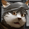
Saw that  trogan was trying to use my tutorials for painting and I needed a break from work so I made a loose paintover with some notes that i usually try to tell people about painting
Hopefully it helps
 trogan was trying to use my tutorials for painting and I needed a break from work so I made a loose paintover with some notes that i usually try to tell people about painting
Hopefully it helps
Category Artwork (Digital) / Doodle
Species Rabbit / Hare
Gender Male
Size 1280 x 492px
File Size 67.9 kB
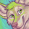
Keep in mind that degree of contrast can also be used to direct viewer attention.
Thus you should also try to limit it to details that are important like face & hands or your focal point. Those two will tell the reader what is happening, and should therefore generally have the highest dark and light values. Everything else can have a lighter max dark and max bright so they don't compete for attention.
Thus you should also try to limit it to details that are important like face & hands or your focal point. Those two will tell the reader what is happening, and should therefore generally have the highest dark and light values. Everything else can have a lighter max dark and max bright so they don't compete for attention.


Well there's one massive plate of helpful ^^. That's awesome of you! I will practice your lessons with joyful abandon, plus it's a very good motivator since I was lacking in such. Can be a real downer when you think you can do something but just don't quite know how yet :)
A questions if I may:
I know that brushes are a hot topic when folks start painting, I see most suggest a hard round in PS and to vary the opacity and nothing more. How do you use your brush to build up the texture and colour variance that I can see in this pic? Is it by building up using a number of low opacity strokes? - I've been trying to make sure what I paint doesn't look like big 'flat' durbs :)
My dexterity re: pressure isnt that great so I only use pen pressure for brush size - even then I will manually adjust brush size using the shortcut ([ and ])
As such I also manually adjust my pen opacity rather than use pen pressure. In this specific case I use the default round brush on pencil setting because I like the hard edges and I'm not too concerned about blending colors smoothly.
40% opacity = trying to blend - use eyedropper a lot
60% opacity = blocking in shadow shapes - pick the darkest color (usually the line) and lay it onto the form
70% opacity = default in-between setting
80-100% opacity = linework and uh, when you want it more opaque. Highlights or when you're certain its the color you want.
Those are the numbers that work best with how I paint, everyone paints differently though :B
The dark edge between two tones that's present throughout the painting is achieved by painting in shapes/areas with a darker color than you intend and then lightening it with the color you wanted all along. It'll create little artifacts that make it look more like a traditional painting and add some texture.
There's a lot of little pieces of advice (especially from traditional painting) that will stick with you
One of the things my college painting instructor said during watercolor was to use the biggest brush you can get away with to start, and that's carried over to digital painting for me. Small brushes are for linework and detail, so when you're starting off, pretend you're using a big brush.
One of the things my college painting instructor said during watercolor was to use the biggest brush you can get away with to start, and that's carried over to digital painting for me. Small brushes are for linework and detail, so when you're starting off, pretend you're using a big brush.


Comments